Bell Company, Inc. Provides ADA Compliant Fonts and Font Colors for Signage
If you want to ensure the fonts and font colors on your signage is ADA (Americans with Disabilities Act) compliant so you help your customers and don’t risk non-compliance fines, you’ve come to the right place. First-time non-compliance fines start at $75,000 USD. Subsequent violations can carry a fine of $150,000 USD or more.At Bell Company, Inc., we’ve been manufacturing signs for more than 80 years—and making signs that adhere to accessibility requirements outlined for fonts and colors in the 2010 ADA Standards for Accessible Design since its publishing. Use this page as a resource to access important guidelines and ensure your signage fonts and colors are ADA compliant.


What Are ADA Requirements?
Font selection may not seem like a big deal in the grand scheme of designing your space and for ADA compliance, however, the Americans with Disabilities Act has a great deal to say about it.
ADA compliant signs convey meaningful information to everyone who interacts with your space. As such, there are many strict requirements that must be met for a sign to be considered ADA compliant. These include requirements related to fonts and colors. However, if you’re unfamiliar with ADA rules and regulations, it can all be a bit overwhelming.
What does the ADA say about fonts, font sizes, and font colors? One of the most important rules of thumb is that ADA compliant signs only use sans serif fonts, but they also get into rules about character style, size, case, height, and more. ADA guidelines differ for raised characters and visual characters, and are as follows:
Raised Character ADA Requirements
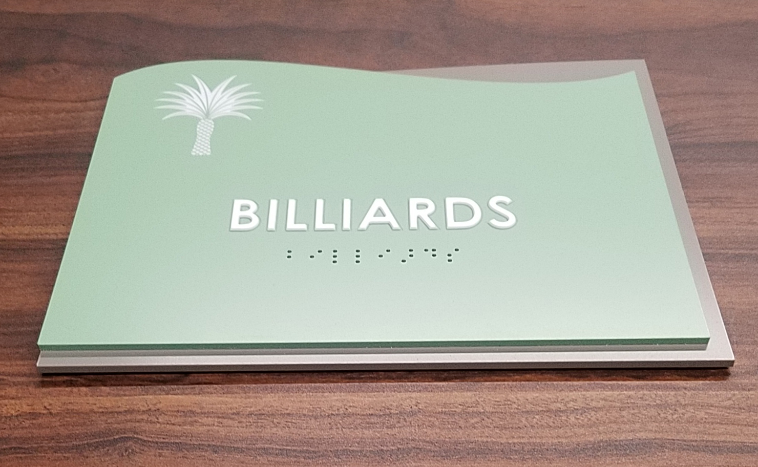
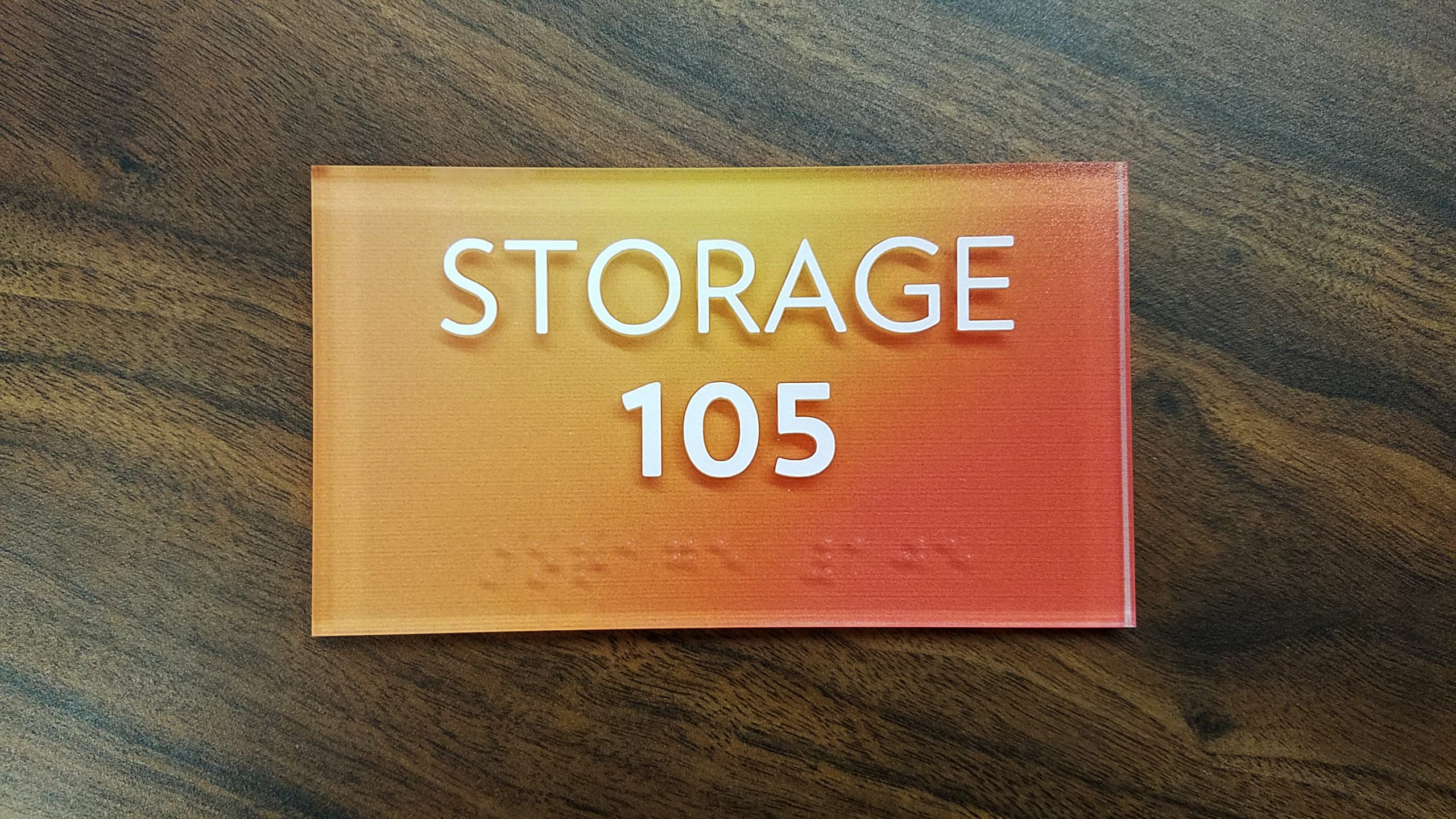
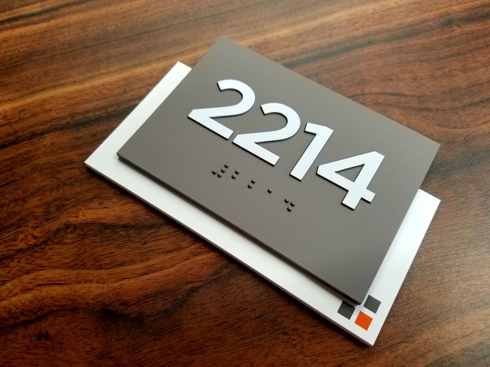
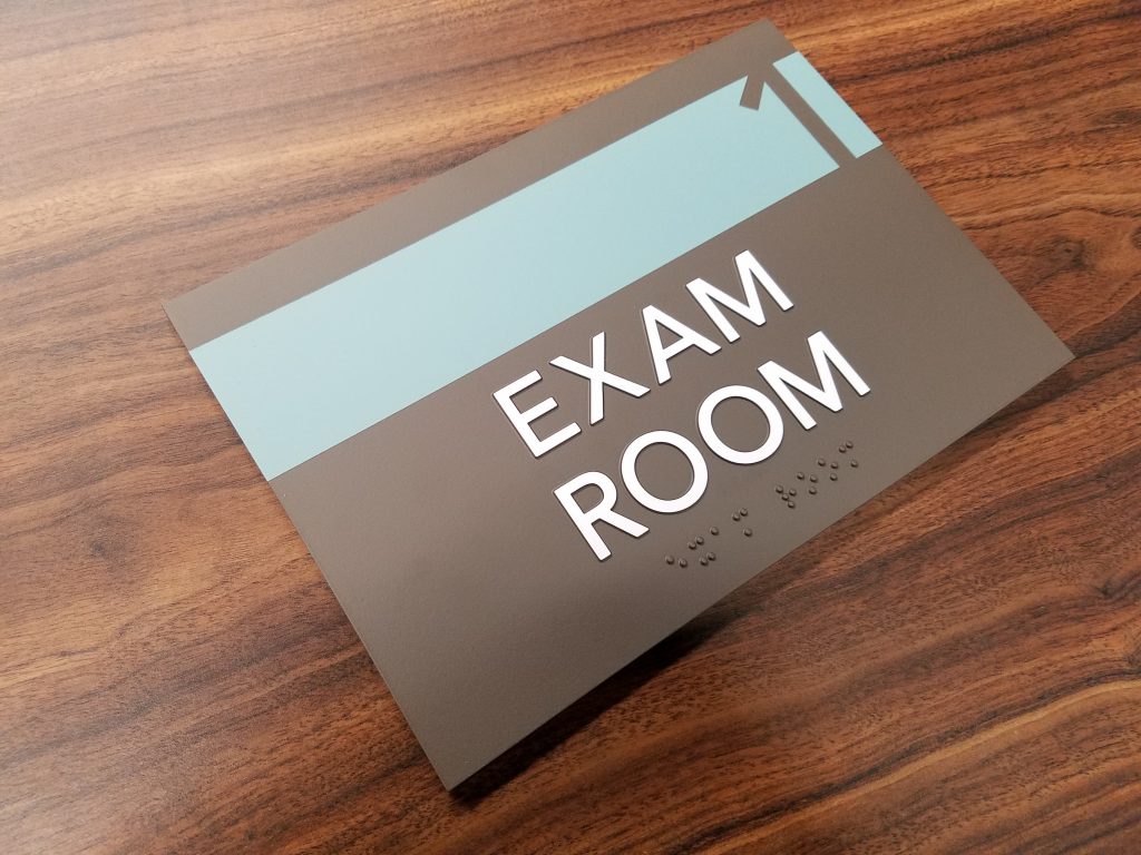
ADA character requirements are highly specific to remain compliant. An overview of these specifications is shown below:
- When there is a need for both visual and tactile characters, there should either be a sign that includes both these characters or two separate signs—one with visual characters and another with tactile characters (General: 703.1).
- The raised characters must follow the requirements outlined in section 703.2 and should also be duplicated in Braille, following the specifications in section 703.3. Furthermore, the installation of raised characters must follow the guidelines specified in section 703.4 (Raised Characters: 703.2).
- Raised characters must be positioned at least 1⁄32” (0.8 mm) above the background surface (Depth: 703.2.1).
- Characters should be uppercase only (Case: 703.2.2).
- The characters must be in a sans serif font style and should not be italicized, oblique, script, highly decorative, or of any other unusual forms (Style: 703.2.3).
- The characters should be chosen from fonts where the width of the uppercase “O” is a minimum of 55% and a maximum of 110% of the height of the uppercase letter “I” (Character Proportions: 703.2.4).
- Based on the height of the uppercase letter “I,” the character’s height, measured vertically from the baseline, should be a minimum of ⅝” (16 mm) and a maximum of 2” (51 mm) (Character Height: 703.2.5). The exception to this is if separate raised and visual characters that contain the same information are present, the height of the raised characters may be a minimum of ½” (13 mm).
- The uppercase letter “I” stroke thickness should not be more than 15% of the height of the character (Stroke Thickness: 703.2.6).
- The character spacing is measured between the two closest points of adjacent raised characters within a message, omitting word spaces. For characters with rectangular cross-sections, the spacing between individual raised characters should be a minimum of ⅛” (3.2 mm) and a maximum of 4x the stroke width of the raised character. For characters with other cross-sections, the spacing between individual raised characters should be a minimum of 1⁄16” (1.6 mm) at the base of the cross sections, and a maximum of 4x the stroke width of the raised character. At the top of the cross sections, the spacing should be a minimum of ⅛” (3.2 mm) and a maximum of 4x the stroke width of the raised character. Characters should also be separated from raised borders and decorative elements by a minimum of ⅜” (9.5 mm) (Character Spacing: 703.2.7).
- The space between the baselines of separate lines of raised characters in a message should be a minimum of 135% and a maximum of 170% of the raised character height (Line Spacing: 703.2.8).
Visual Character ADA Requirements
- Characters can be uppercase, lowercase, or a mix of both (Case: 703.5.2).
- Characters should follow conventional form and should not be italicized, oblique, script, highly decorative, or any other unusual forms (Style: 703.5.3).
- Characters should be chosen from fonts where the width of the uppercase letter “O” is at least 55% and at most 110% of the height of the uppercase letter “I,” (Character Proportions: 703.5.4).
- The minimum character height should adhere to the specifications provided in Table 703.5.5 (page 195). The viewing distance is measured as the horizontal distance between the character and an obstacle that prevents coming any closer toward the sign. The character height should be determined based on the height of the uppercase letter “I,” (Character Height: 703.5.5)
- Visual characters should be positioned at a minimum height of 40” (1015 mm) above the finish floor or ground. The exceptions to this are visual characters indicating elevator car controls (Height From Finish Floor or Ground: 703.5.6).
- The stroke thickness of the uppercase letter “I” should be a minimum of 10% and a maximum of 30% of the character’s height (Stroke Thickness: 703.5.7).
- Excluding word spaces, character spacing should be measured between the closest points of adjacent characters. The spacing between individual characters should be a minimum of 10% and a maximum of 35% of the character’s height (Character Spacing: 703.5.8).
- The spacing between the baselines of separate lines of characters within a phrase should be a minimum of 135% and a maximum of 170% of the character’s height (Line Spacing: 703.5.9).
As you can see, there are many steps to making sure your signage is ADA compliant, and it can be daunting for a business owner to make sure all these qualifications are met. Our experts will ensure all of your signage complies with the above accessibility requirements so you can have peace of mind.


What Are Accessible Fonts?
In order to make sure a space is set up well for everyone, you’ll want to utilize accessible fonts in your signage. “But what makes a font accessible,” you might ask? Accessible fonts are specifically designed to help people with visual impairments and individuals with low vision read and comprehend text more easily. Enhanced letter spacing, bold outlines, higher contrast ratio, and wider characters are a few of the most common accessibility features of a font.
What Are Ideal Fonts for Accessibility and People with Visual Impairments?
You’re probably wondering what the best fonts are for accessibility, which also meet all of the accessibility guidelines outlined above. Good news: There are actually quite a few. However, some are better than others, and choosing the right font isn’t always easy. And even though there are many guidelines, the ADA doesn’t specify which fonts are allowed. It only forbids certain fonts that are italic, oblique, highly decorative, scripts, unusual, or otherwise inaccessible fonts. The only true requirement is that it has to be a sans serif font.
At Bell Company, we’ll help you find the ideal font for your business that fits your brand, meets ADA compliance, and shows your business’s commitment to inclusivity. As a starter guide, here’s a list of accessible sans serif typefaces that meet accessibility guidelines and are commonly used for ADA signage. Some were even designed specifically for accessibility purposes. The below list is not exhaustive of all the different fonts that are ADA compliant.
Common fonts that meet accessibility guidelines, include:
- Avenir Lt Std
- Arial
- Frutiger
- Gill Sans
- Futura Book
- Optima
- Helvetica
- Swis721 BT
- Myriad Pro
- Verdana
- Avant Garde
- Tahoma
- Century Gothic
- Univers 55
- Franklin Gothic
- Calibri
As you can see by the above list, you’re not overly limited in the variety of accessible fonts you can choose from. If you’re not sure how to find or identify the right accessible font for you, we’re more than happy to provide an expert recommendation.
What Are the Best Colors for Accessibility and Those Visually Impaired?
The rule of thumb for font color regarding accessibility and ADA compliant signs is high color contrast. According to ADA’s requirements for visual characters:
- 703.5.1 Finish and Contrast. Characters and their background shall have a non-glare finish. Characters shall contrast with their background with either light characters on a dark background or dark characters on a light background.
This means if your sign has a white background, you should use a dark font color like blue, black, or brown. And if your sign has a dark background, the font color should be light, like white, cream, or beige to fulfill the color contrast requirement.
At Bell Company Inc., we offer a large variety of background colors (with different gloss levels) and font colors to choose from for your ADA compliant signage. Our experts will help you choose an accessible font color and background combination that meets the color contrast guideline and your signage display needs.
Use Ideal Fonts for Accessibility with Bell Company, Inc.
Using accessible fonts may seem like a small detail, but it makes a big difference for a significant portion of the population (and your business). By using ideal fonts for accessibility’s sake and for individuals with visual impairments or low vision, your business becomes a safer public space for everyone.
At Bell Company, we take the guesswork out of ensuring your signage uses ADA compliant fonts and font colors to avoid fines and non-compliance issues. We prioritize both your design requests and a strict adherence to ADA compliance to make sure you get visually appealing and purpose-built signs for your building—all while being budget-conscious throughout the project.
Request a quote today to get started.
